I recently spent a week locked in a boardroom with my management team and chairman developing our company strategy for short, medium, and long-range horizons. At one point during that week I stumbled upon a new way of representing and evaluating choices between different projects, each with different resource requirements and benefiting different customers or segments. At its core, it's a directed graph.
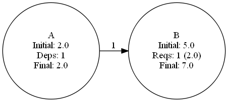
In this simplest of examples, there's a project A which costs 2 units. Project B depends upon 100% of A and itself costs 5 units. What does B really cost? B + 1.0 * A = 5 + 2 = 7 units.
Simple enough, right? Nodes are projects, and have costs. Edges are dependencies between projects, and have weights. The full cost of any project is the weighted sum of all its dependencies and its own internal cost.
Simple enough, right? Nodes are projects, and have costs. Edges are dependencies between projects, and have weights. The full cost of any project is the weighted sum of all its dependencies and its own internal cost.
Here's a more complex example.
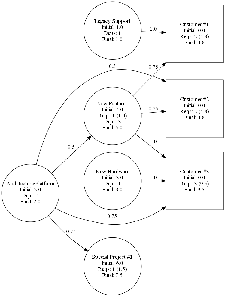
Here we have more projects, direct and indirect dependencies with varying weights, and customer-facing projects or outcomes (shown as squares).
If we pick on the Customer #3 project (which has no base cost for itself), we see it requires 100% of the New Hardware project (cost = 1.0 * 3 = 3), 75% of the Architecture/Platform project (cost = 0.75 * 2 = 1.5), and 100% of the New Features project - which itself needed 50% of the Architecture/Platform project too. That bumped the New Features project up from an initial cost of 4.0 to a true cost of 5.0, leaving Customer #3 with a total cost of 9.5.
But wait! We're double-counting there. Surely the Customer #3 project doesn't need 75% of the Architecture/Platform project directed and also another 50% indirectly via the New Features project?
Well... maybe. Or perhaps this tool only makes sense if you agree not to add dependencies beyond one 'layer'? There's an element of biomagnification going on here anyway, since the final costs of all customer-facing projects total to more than the total cost of all the other projects anyway.
At any rate, what I found in practice was that this way of visualising things had the immediate effect of halting an argument that all our customers were equally important. In our example not so different from this picture, it immediately showed that one customer had by far more costs than any other. Even though many of the requirements were shared - something this view also reveals - the disparity was not what our sales folks thought. And when one customer costs you more, it had better pay you more to make up for it!
I'm interested to explore this idea a bit more, and see if it is of real use in the business world or whether I just stumbled across a suitable piece of business bullshit at the exact right moment to win an argument. I suspect there may be some interesting use-cases that involve normalising the out-edges and/or in-edges (i.e. summing them up and dividing each by the total, so the weights sum to 1.0).
If you're interested in playing around with this concept, my sample code in Python is attached below.
Graph generation code using graphviz (dot)
 RSS Feed